Posted by France-IX on LinkedIn
First published on LinkedIn on 30 June 2026 · view the LinkedIn page
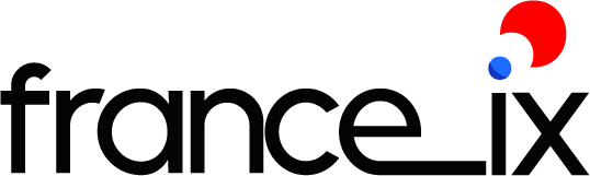
France 9? A TGV? A snail? Superman? That’s what some people read in our logo.
For an Internet exchange point, we’ve seen clearer.
Our logo was dated: a script typeface that was hard to read from a distance, illegible as a favicon or in an email signature, with a cursive “france” next to an “IX” in capitals, and no dot on the i.
We didn’t reinvent everything: we made legible what wasn’t.
What we keep:
- the tricolour, our trademark;
- a bolder IX.
What we are changing:
- a modern, technical typeface;
- a logo that adapts everywhere, down to the smallest favicon.
For France-IX, this new logo is a natural evolution that respects our history while looking to the future.
In short, the same France-IX, only sharper!
This news was first published on LinkedIn. To comment or share it, head to the original post. → See the post